Tech company logos redux
Call off the design agency, I've finished next year's logos already.
14 September 2018
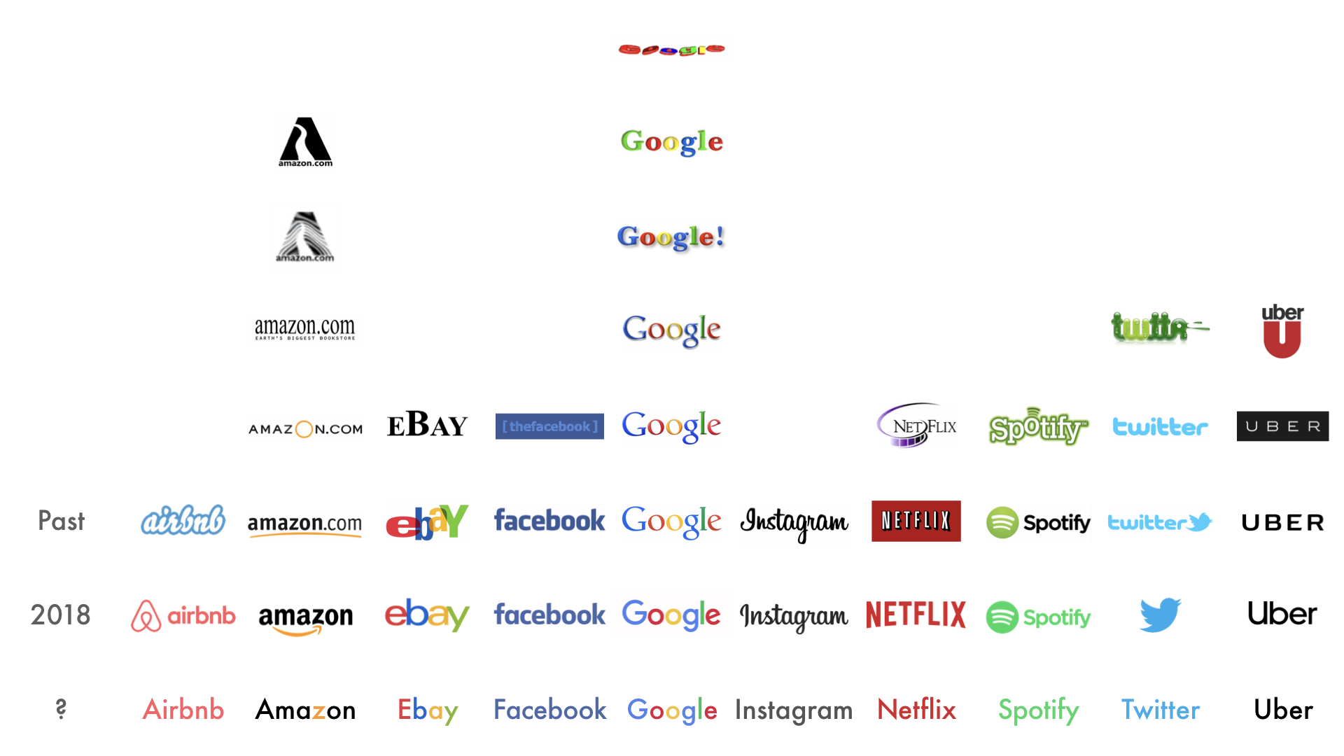
Tech companies love a brand refresh. Uber is the most recent to unveil a new look; it’s been generally well received, but it’s also part of a curious trend toward logos that are:
- Simple
- Flat
- Sans-serif
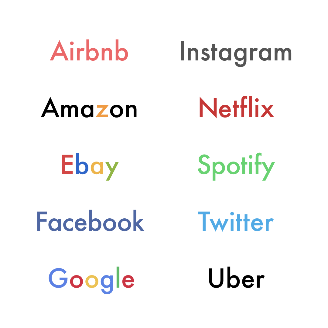
If things carry on like this then it won’t be long until we hit some sort of logo singularity. So rather than sitting around waiting for it, I thought I’d redesign everyone’s logos myself.
I kept each company’s brand colours, and went for:
- No logomarks (sorry, Twitter)
- Proper case
- Futura
And these are the results. Not bad, right?